Sunday, 29 June 2014


Sunday, 15 June 2014


Production Meeting Reflection Four
This week the main task that I had to complete were developing the graphics power point synced with the master script. To make the power point it took me two whole lessons to complete because at that time the master script was not completed and I need each shot number for the graphics. Once the master script was done and the power point was completed I then developed the logo how Jada and Jasmeet wanted it because the first draft didn't have the logo for 5 seconds at the end once I added the logo in I then re synced the introduction with a song. Dan Croll - From Nowhere (baardsen remix). Once the introduction was synced I then uploaded the introduction to YouTube so for the reflection meeting I can show the class. On Fridays lesson i downloaded the final introduction for Farhana to import in to the V's i also decided to make the guess the nose props as the set designer was ill. In this week the only part that didn't go well was rendering the right format for the introduction that would go on the Mac because i first tried mp4 and for some reason the mac wouldn't play it so I then spoke to my teacher and we both agreed to put the introduction on youtube and then download it.
Dan Croll - From Nowhere Baardsen Remix^^^^^^^
The Beat final introduction with music and the logo
The Beat final introduction with music and the logo
Wednesday, 11 June 2014
Sunday, 8 June 2014
Production Meeting Reflection Three
 Within this week my task was to make a introduction that would play right at the start of the show for 15 seconds.The introduction was the main task for the week so I decided to develop three diffrent templates to pick from The first template was yellow paint in 3D clashing and turning around 360 degrees then to drop down to the text "The Beat". The seconds introduction was the same but instead of black background i put a purple overlay on it to match the shows colour scheme. The third introduction was more random than the others because instead of paint splatters it looked more like blood drops so we discarded the idea.
This week has particularly been very successful because I made the introduction within two lessons and then started on the twitter overlay that will come up n the VT's. The introductions have been very successfully because the directer pitched a idea of paint splatter on text and i did that but developed the idea more to make it look more professional than stranded work.
All that I need to change or develop change with the introduction is by adding on 4 more seconds to go with the running order by adding the the 4 seconds i would have to add the logo in to the introduction so to do this i would need to take the text layer off and save the paint platters as a diffrent JPEG image and import both the text manually and the import that image of the paint. I will also have to animate the text "the beat" how the director initially wanted it.
Next week I intend to complete the twitter overlay and import them on to the pre recoded video. I will also be talking to the director on all the other graphics i need to do for example the names of the presenters when they come on the stage and I also will be starting the power point once all the graphics are done.
Within this week I worked with both roles above me on the hierarchy table the first person i worked with was the Director Jasmeet she pitched the idea of the twitter idea and then i created most of it and then we decided on the range of tweets and how they are going to be shown. I also worked with Farhana the VT operator i helped her with recording for "street beat" i also helped her with editing apart from that i thick we worked well because we fished nearly all of the task for the next 2 weeks
Sunday, 1 June 2014
Production Meeting Reflection Two
In this week we all started our job roles as a class and worked together to get the best possible out come for the week. My role as a Graphics Designer was to develop a draft of the logo with in the week and to have the logo completed before anyone completed there documentation. I first created a draft of the logo in black and white as the director Jasmeet and Jada was not sure about the colors we wanted because for the green screen we were not aloud to used black or blue and in the initial logo that Jada and made the logo was blue and black.
The groups response to the logo was good because it was bold and vibrant and we wanted the logo to stand out. As a whole we did find it hard to find a scheme that we all liked so when creating the logos shown in the i would only change the paint splatter and the colour of the text and make five drafts as shown in the Documentation post on this blog.
 For my role as the Graphics designer the most successful task has been crating the logo 2 prier to the dead line and crafting a logo that we all liked.
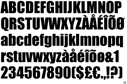
The one issue i currently that we have decided on is the font i think the font that we used "IMPACT" was abit over used for graphics general apart from that everything is fine.
Next week i intend to work on three draft's of the intro that i will develop which will last between 10-11 seconds i also will be working on a outro and a twitter feed in my own time and on my personal computer.
With in this week i mostly worked with my self apart from getting itched the idea of the logo by the director and then pitching the logo's i have made to every one else. I think i worked well with the Director Jasmeet quite well because prier to the dead line on Friday i made the logo for Wednesday. Apart from that me working with the director was effective because we got the logo done and the colour scheme picked for the whole show. With the draft i wanted to show that there's were more than one option and that other things can be created but still linked to the idea of paint splatters i also wanted to show my own talent in creating introductions on sony vages
The groups response to the logo was good because it was bold and vibrant and we wanted the logo to stand out. As a whole we did find it hard to find a scheme that we all liked so when creating the logos shown in the i would only change the paint splatter and the colour of the text and make five drafts as shown in the Documentation post on this blog.
For my role as the Graphics designer the most successful task has been crating the logo 2 prier to the dead line and crafting a logo that we all liked.The one issue i currently that we have decided on is the font i think the font that we used "IMPACT" was abit over used for graphics general apart from that everything is fine.
Next week i intend to work on three draft's of the intro that i will develop which will last between 10-11 seconds i also will be working on a outro and a twitter feed in my own time and on my personal computer.
With in this week i mostly worked with my self apart from getting itched the idea of the logo by the director and then pitching the logo's i have made to every one else. I think i worked well with the Director Jasmeet quite well because prier to the dead line on Friday i made the logo for Wednesday. Apart from that me working with the director was effective because we got the logo done and the colour scheme picked for the whole show. With the draft i wanted to show that there's were more than one option and that other things can be created but still linked to the idea of paint splatters i also wanted to show my own talent in creating introductions on sony vages
Production Documentation Graphics Generator
My role with in the whole multi camera production is to create the graphics for the show. I have made a rough copy of what the initial ideas are for the logo that the Director Jasmeet wanted for the show. The paint of the logo was the show the paint splatters i have decided to pick two paint splatters because there are two different words one splatter of one of the words. Currently we are decided on the colors of the splatter because be cant use black or blue. This current design of the logo would be on the VT in the top right or left of the corner. At the moment we are also discussing the font that we will use on the logo. In school time we are working on the logo on Photoshop and at home im working on the 10 second intro on Sony Vegas because we don't have the software at school .
 |
| Logo one |
 |
| Logo two |
 |
| Logo three |
 |
| Logo four |
 |
| Logo five After discussing the Logo with every one in a "What's app" group we finally decided that the color scheme will be yellow and purple and the logo we have chosen is logo five |
Subscribe to:
Comments (Atom)