The groups response to the logo was good because it was bold and vibrant and we wanted the logo to stand out. As a whole we did find it hard to find a scheme that we all liked so when creating the logos shown in the i would only change the paint splatter and the colour of the text and make five drafts as shown in the Documentation post on this blog.
 For my role as the Graphics designer the most successful task has been crating the logo 2 prier to the dead line and crafting a logo that we all liked.
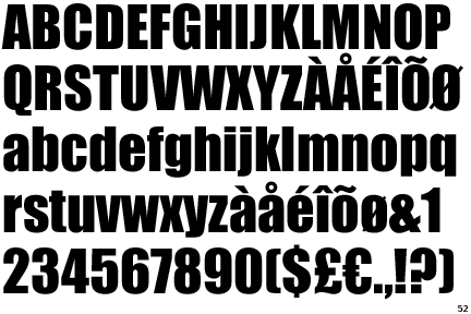
The one issue i currently that we have decided on is the font i think the font that we used "IMPACT" was abit over used for graphics general apart from that everything is fine.
Next week i intend to work on three draft's of the intro that i will develop which will last between 10-11 seconds i also will be working on a outro and a twitter feed in my own time and on my personal computer.
With in this week i mostly worked with my self apart from getting itched the idea of the logo by the director and then pitching the logo's i have made to every one else. I think i worked well with the Director Jasmeet quite well because prier to the dead line on Friday i made the logo for Wednesday. Apart from that me working with the director was effective because we got the logo done and the colour scheme picked for the whole show. With the draft i wanted to show that there's were more than one option and that other things can be created but still linked to the idea of paint splatters i also wanted to show my own talent in creating introductions on sony vages
No comments:
Post a Comment